Wednesday, 16 April 2014


Tuesday, 15 April 2014
About Feedback
Why I will be collecting feedback
I wanted to see what my fellow colleagues and public audience thought about my billboard. I asked a number of questions in order to see whether I could improve anything and to see what worked well. It is always important to ask for feedback as it is good to have a second opinion as they may be able to spot something that I might not have been able to. Throughout my research I found out that my newspaper's target audience is more aimed at a older generation however I wanted to use my billboard as a pin point opportunity to attract a slightly younger generation in order to attract a wider audience. I have made the billboard a more creative and fun side to the product for me to attract both generations.
I wanted to see what my fellow colleagues and public audience thought about my billboard. I asked a number of questions in order to see whether I could improve anything and to see what worked well. It is always important to ask for feedback as it is good to have a second opinion as they may be able to spot something that I might not have been able to. Throughout my research I found out that my newspaper's target audience is more aimed at a older generation however I wanted to use my billboard as a pin point opportunity to attract a slightly younger generation in order to attract a wider audience. I have made the billboard a more creative and fun side to the product for me to attract both generations.
Monday, 14 April 2014

Evaluation
Website Evaluation
I am overall happy with my website as my logo is very clearly stated at the top of the page and all my buttons worked well.

I am overall happy with my website as my logo is very clearly stated at the top of the page and all my buttons worked well.
I chose to link the pages:
- Home Page
- Contact Us
- Travel
Sunday, 13 April 2014
Bibliography for my billboard research.
Bibliography for my billboard research.
The sun
wear a poppy
qr billboard
phone and building
http://fc00.deviantart.net/fs71/f/2011/218/b/3/qr_code_building_explanation_by_thedorian-d45ovno.jpg
mcdonalds billboard
new york
new york 2
mcdonald bus stop
bus stop advert
bus advert 2
drop billboard
cadbury billboard
freddo
rose
dairy milk
forever 21 billboard
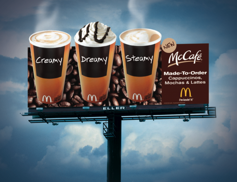
mcdonalds coffee billborad
future ramer billboard
mcdonald billboard
mcdonalds coffee poor
Logo
My logo image will be recognised by my audience. If i wanted to extend into further advertisements I could create a phone app and have this as the logo so my target audience instantly know that this logo means 'Whitstable Periodical' newspaper.

Thursday, 10 April 2014
Bibliography
Bibliography for my newspaper research
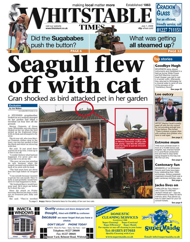
Whistable times.
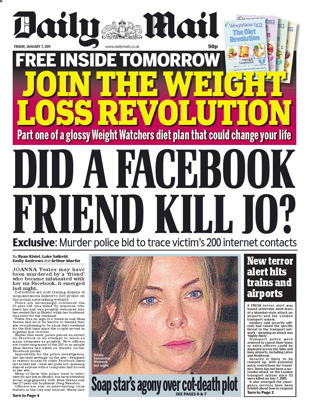
daily mail
daily mail 2
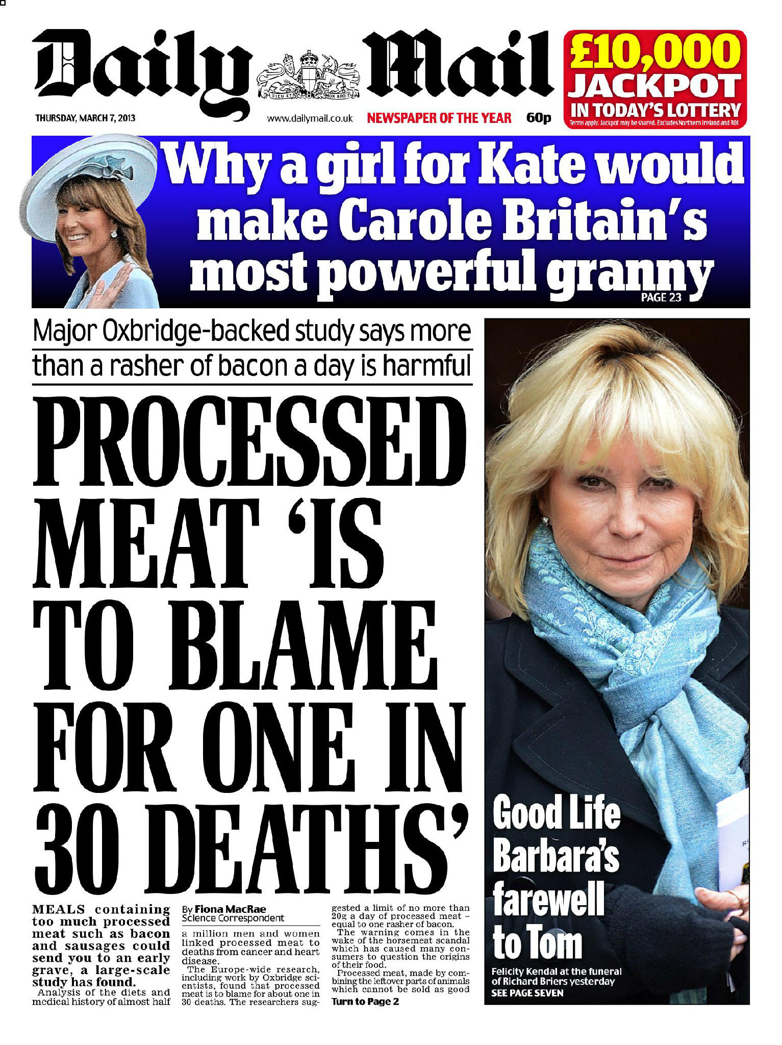
daily mail 3
Monday, 7 April 2014

Saturday, 5 April 2014

Monday, 31 March 2014
Imagery Used
I have taken the perfect image for my theme of the weather. Whitstable have been going through some strong winds, this is why the picture is suited for the theme as it portrays the weather being dramatic and heavy winds.

This is the original image that I have captured in Whitstable however I have done research on bus background images on billboards and shows that the image has been edited lighter in order for the text to stand out clear. From this information I then wanted to edit the image in order to for me to have a lighter background picture. I used Photoshop to do this. I used Photoshop in my As task last year so I was able to remember how to edit images. It was still good being able to recap everything I had learnt last year on Photoshop as I still managed to gain editing skills from this task itself.

Above is what my image then became after I had edited it. It suits my layout of the billboard and is light in all the right areas so I am able to place text above the image. Using the rule of three, the dimensions of the page are more focused on the left hand side; this means that when I come to placing my text over my image It will need a focus point which will most likely be to the right hand side as it will have a clear background which will make the text more flattering apposed to the other side of the page which wouldn't contrast as well as it would on the right hand side.
Sunday, 30 March 2014
Creating My Billboard

I started creating my billboard by adding more features in such as my main text onto the page. I have put the text at a slant so it stands out for people's awareness to create an illusion. I wanted to see what the text would look like on top of this image so I got this image from the internet just to test out how strong the background is going to be against the writing and features. I am currently taking pictures for my billboard, I will then upload them and change the background image in order to use my own primary resources.
Saturday, 29 March 2014
Planning out my design
In order for me to create my billboard I need to consider the basic bus features in order to design around them.


Above I have shown a basic layout of bus features so am i able to work around them in order to convey a bus billboard. I have put the 4A on there for a reason, this is the bus route number to Whitstable which connects to my newspaper being called 'Whitstable Periodical'.
Friday, 28 March 2014
Billboard Evaluation
It just goes to show how much primary and secondary resources can really change a tasks performance. I have shown a before and after of the image that I have used. My picture is a lot clearer and I have edited it using Photoshop to brighten the image.  |
Before
|
 |
| After |





Newspaper Title
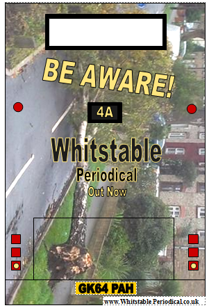
I have used grid lines to use the rule of third to adjust this image to make the structure right. My main focus is being brought to the window area of the bus, I do not want this because it is taking my attention from my main title. I will edit this this in order for the focus point to be taken back to the centre of the billboard.
Ideas
After I came to a conclusion that I could not make my billboard 3D as the limitations were too high in risking people's safety in case of distractions and/or objects may fall off if the bus forgets about them at the back.I now need to focus on how I am going to make a 2D billboard stand out. I thought by using the back of the bus as the location for the billboard, it will be more suitable as my aim from it is to warn drivers about the danger in the weather at the moment.

The example above I have provided is a form of advertisement and has incorporated a large background image in order to really stand out. The bus is taller than all the other vehicles on the road, this means that cars far away can even see this billboard. This is why form of billboard works so well as it has a large image to draw your attention to and buses travel on similar routes so people will start recognizing the billboard and looking more into it every time it passes.
Subscribe to:
Posts (Atom)